2017
Ctrl+Shift+Chaos
for Delusions
& Errors
MISC. / POSTER


Delusions and Errors was an exhibition initiated by Engy Aly who worked together with Möbius Design Studio to invite 28 graphic artists and designers from the region, including myself, to create posters in response to their choice of the following dichotomies: Accident vs. Intention, Author vs. Onlooker, Control vs. Chaos, Predictability vs. Surprise, Fact vs. Fantasy, Dismissal vs. Acknowledgement, Failure vs. Accuracy, Representation vs. Implication.
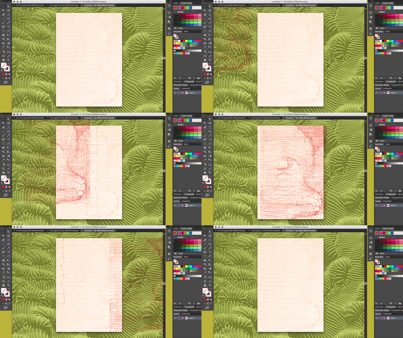
I chose Control vs. Chaos, because it’s a big theme for me on a personal level and in my work. What I wanted to do was to create a poster in a way that goes against my nature / my rather controlled process, and to play around with the themes of control vs. chaos in the creation of the poster itself as an exploration to see how it would affect the outcome. I wanted very simply to be chaotic and haphazard in my process, and to act on every whim without organizing, rationalizing or structuring.
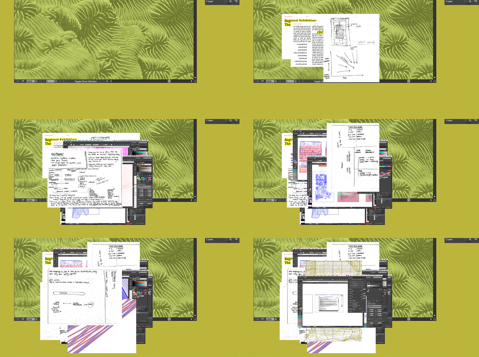
Normally in my design process I am working with the outcome in mind; I want to simplify, organize and highlight things in a way that helps me send a clear message to the viewer, probably in an attempt to control their reaction. I want to crystallize an idea and then create a focal point or hierarchy that guides the eye in the way that I want. So here I fought all those instincts/ habits and I was purely driven by enjoying the process and leaning into the chaotic nature of how our minds work without resisting that and learning to embrace the first thought or idea that pop into my head.
As part of the process I wrote my thoughts around control, predictability, the graphic design industry, clients, deadlines, visual trends among other things and didn’t try to forge it into a coherent thought or conclusion in the end. I let the process express itself in the poster. It was very freeing and playful and I feel it changed something in the way that I design since then. Most of the time I do need to be far less chaotic in my work (hopefully, understandably), but it helped me let go in some way and allow more room for the audience in their interpretation or experience.


EXHIBITIONS
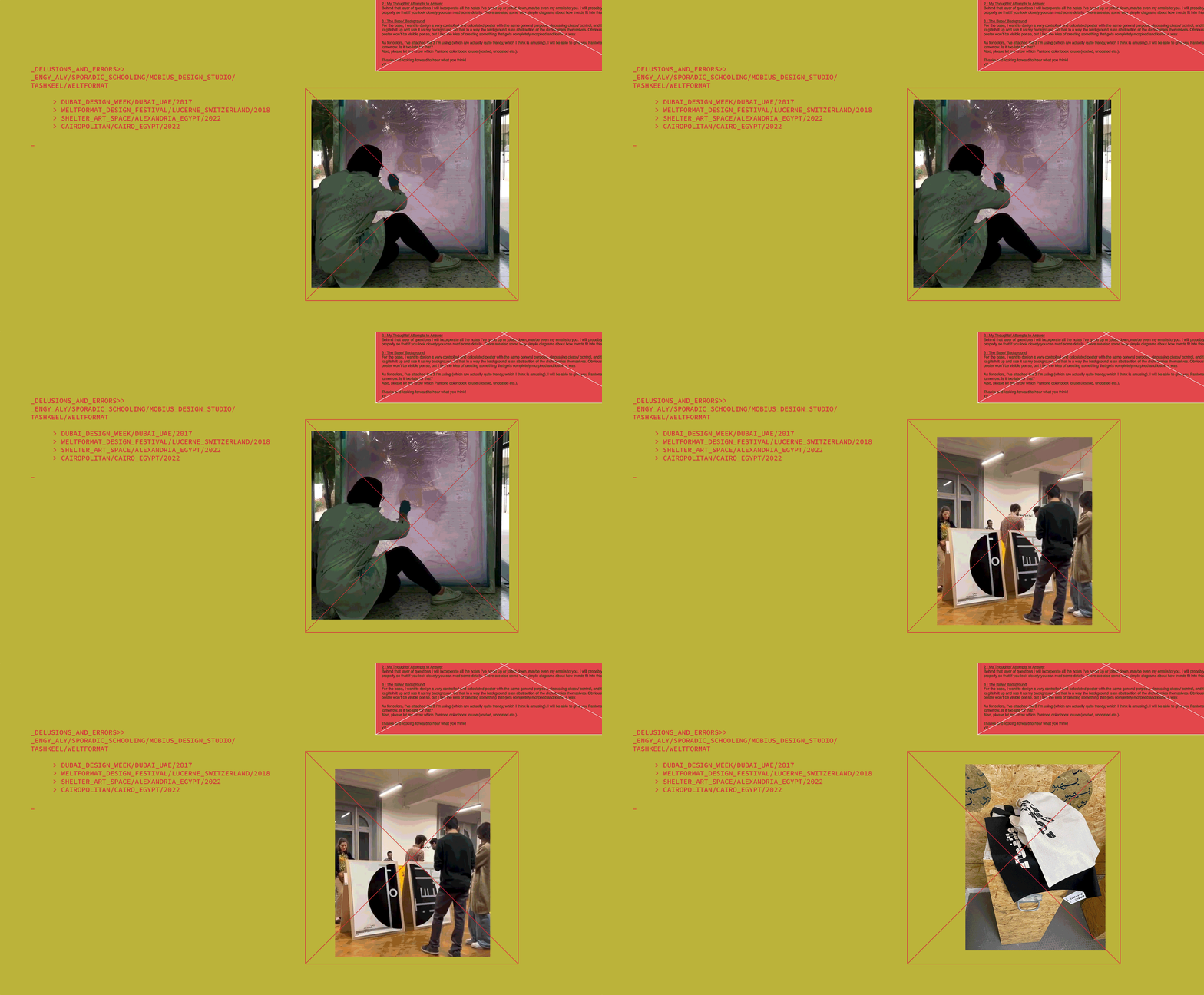
︎︎︎ Delusions and Errors has been exhibited at Dubai Design Week [2017], the Weltformat Graphic Design Festival in Lucerne - Switzerland [2018], Shelter Art Space in Alexandria [2022] and Cairopolitan [2022].
︎︎︎ With posters by Nora Aly, Foundland's Ghalia Elsrakbi, Ahmad Hammoud, Ibrahim Eslam, Rasha Dakkak, Kambiz Shafei, Pouya Ahmadi, eyen, Fikra, Khalid Mezaina, Maged El Sokkary, Mahmud Şahan, Marwan Sharkasi, Mayar El-Bakry, Nada AlYafei, Pascal Zoghbi, Rabeeya A Jabbar, Salma Shamel, Turbo, Yara Soliman, Zena Adhami, Tulip Hazbar, Ibrahim Zaki, Mohamed Andeel, Mahmoud Tarif, Kristyan Sarkis, Ghaya Bin Mesmar and myself.
CREDITS
︎︎︎ Website and portfolio designed with Mariam Khattab
︎︎︎ Photos from Dubai Design Week, Christine Müller, Weltformat, Shelter Art Space and Cairopolitan
︎︎︎ Poster production by Christine Müller and Rowan Ashraf

