2018
11th Panorama of
the European Film
for Zawya
EVENTS
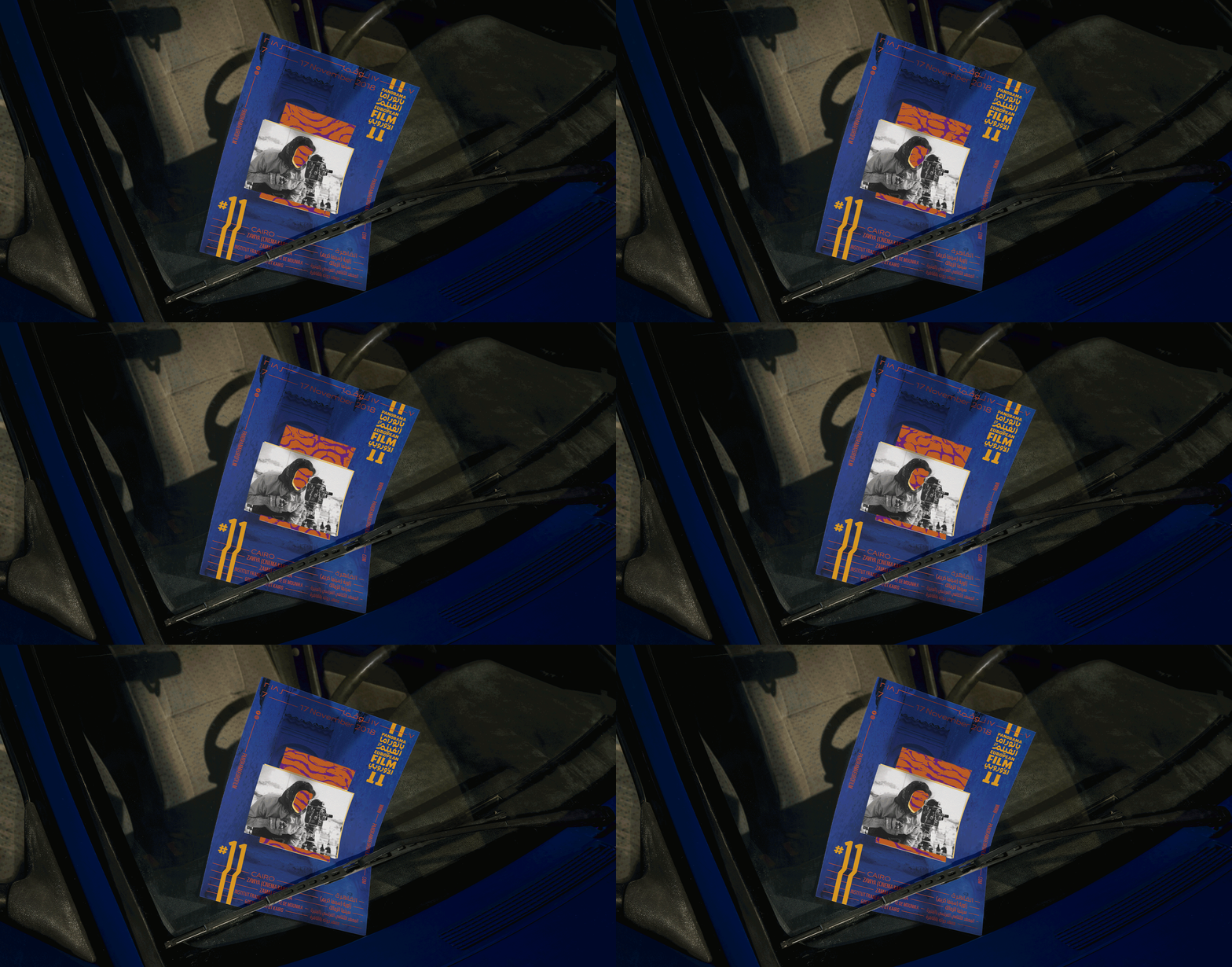
In 2018, I was invited to design the identity for the 11th Panorama of the European Film (you can check out the 10th edition here). The PEF is a (mostly) annual film festival - organized by Zawya - bringing critically acclaimed European films to an Egyptian audience. Aside from having previously worked at Zawya/ at Misr International Films (Zawya’s mother company), I also hold the PEF dear, because I watched Lars von Trier’s ‘Dancer in the Dark’ in 2000 as part of the 1st ever PEF with my aunt when I was a kid. It was so different from anything I had ever seen on a big screen and it stayed with me and so to be working on the Panorama felt very full-circle for me.
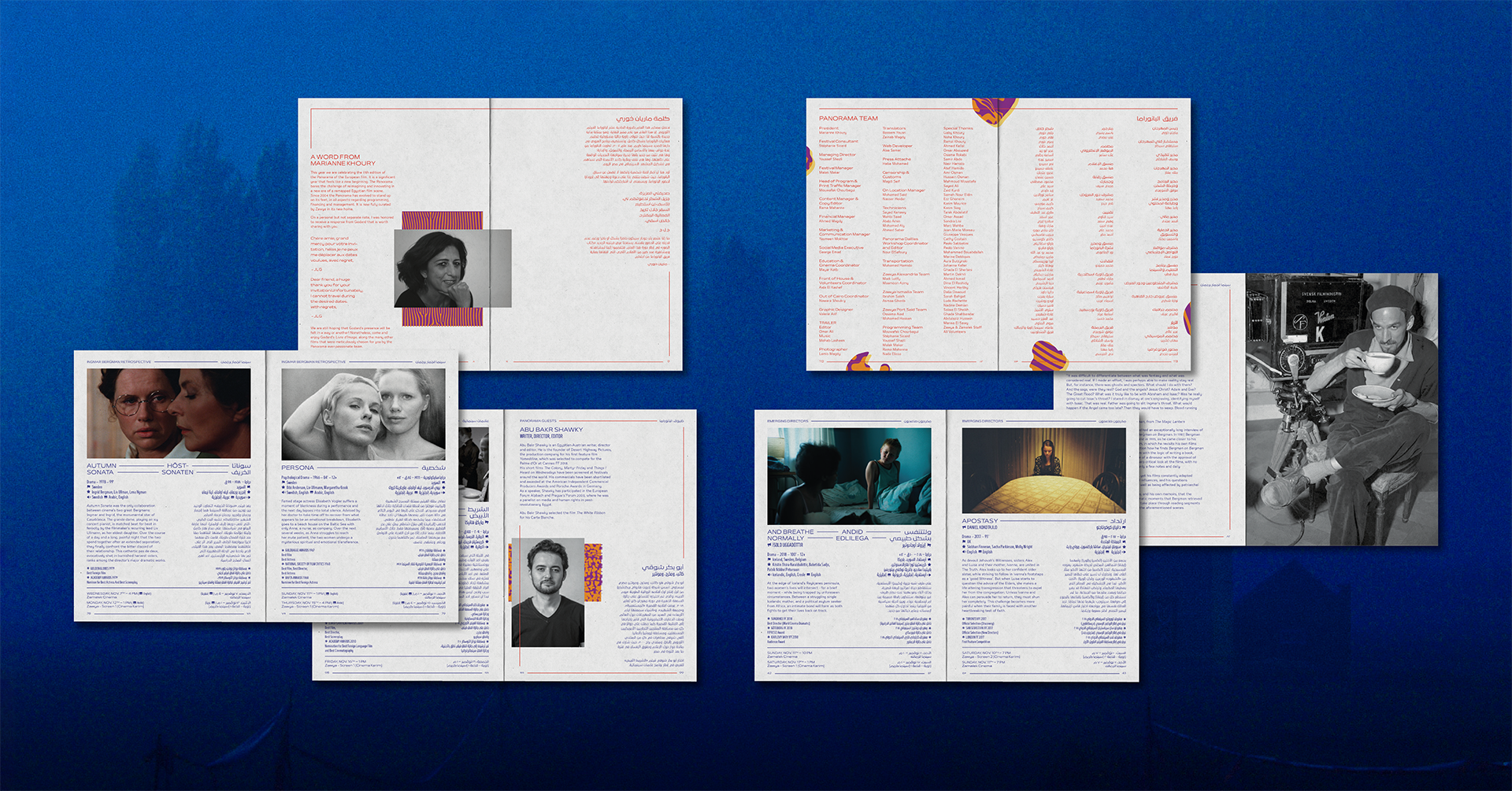
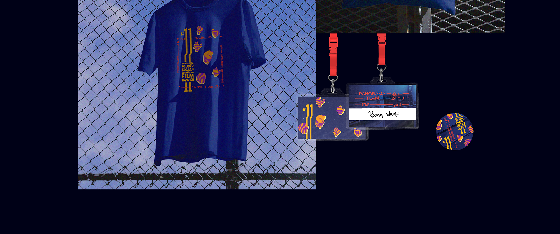
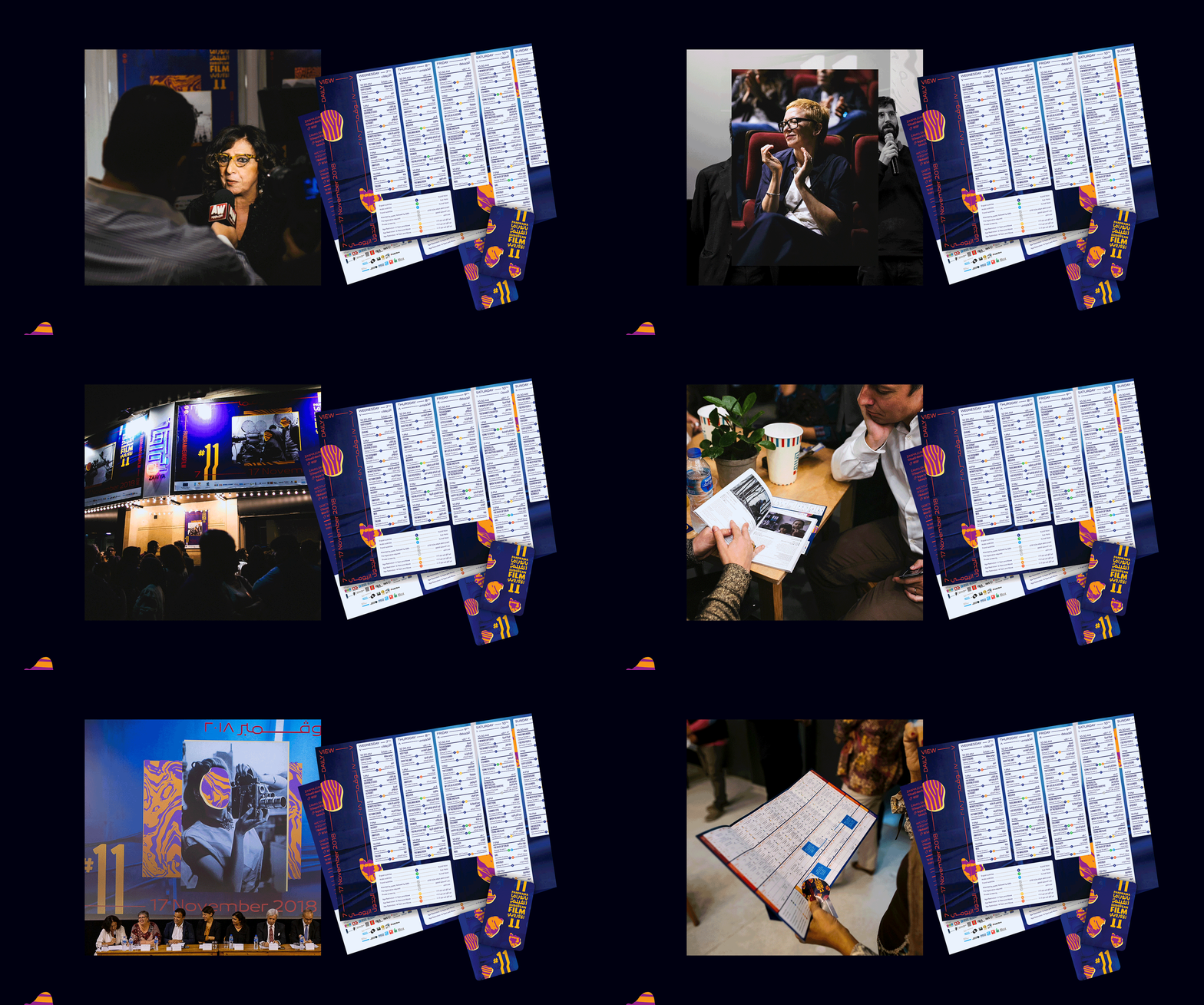
This time around the idea that I wanted to express in the event’s identity was that cinema allows us to see the world through the filmmaker’s eyes or that it gives us a glimpse into who they are and how they think &/ how they see the world. I used old, black and white photographs, cutting out the director’s or camera-person’s face and revealing colorful patterns behind them. I added fine red lines to connect the 2 languages, and I paired a very wide font with a narrow one (shoutout to Bukra and 29LT). I also used these red strips of lines and text to frame certain applications of the identity.
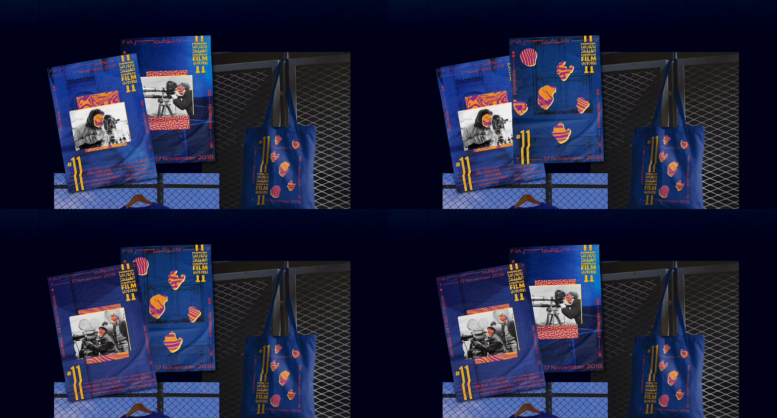
Initially I was proposing a very different color scheme: a pastel direction, paired with strong black and white patterns and the red highlights. Unfortunately the Zawya team was not ready for pastels and sadly I am petty enough to bring it up here and now, several years later. While this great loss still eats away at me, I continue to have a very good relationship with Zawya that allows me to be this shady right now for no reason.
One thing that made this edition really fun for me was deciding not to define a particular shade of blue for the base of the designs. The previous year I had fought hard to have a consistency in how the colors looked on every application (from different suppliers, to different materials, to different printing techniques) and it had proved impossible. To free myself from the shackles of perfectionism I decided to define the background color as ‘any shade of relatively dark blue’ for the 11th edition. And so this time around everything was a different shade, but it was by design and I felt it was a fun and adaptable way to make production limitations work to our advantage.
One thing that made this edition really fun for me was deciding not to define a particular shade of blue for the base of the designs. The previous year I had fought hard to have a consistency in how the colors looked on every application (from different suppliers, to different materials, to different printing techniques) and it had proved impossible. To free myself from the shackles of perfectionism I decided to define the background color as ‘any shade of relatively dark blue’ for the 11th edition. And so this time around everything was a different shade, but it was by design and I felt it was a fun and adaptable way to make production limitations work to our advantage.

EXHIBITIONS
︎︎︎ The poster series was selected for the 3rd edition of 100 Best Arabic Posters in 2020 and exhibited along with the work of other artists and designers from the region at the AUC’s Tahrir Cultural Center in Cairo, Cultuurcentrum Ter Dilft in Bornem - Belgium, Warehouse421 in Abu Dhabi, the Saudi Design Festival in Diriyah, Birzeit University in Palestine, The Design Show in Cairo and the Bibliotheca Alexandrina.
︎︎︎ The posters were also selected to be part of Cairopolitan’s Cairo Prints II in 2021 and were showcased in a group exhibition at the Cairopolitan gallery, the Institut Français d’Égypte and the Institut Français d’Archéologie Orientale in Cairo that year.
PURCHASE
︎︎︎ The poster series is available for purchase at the Cairopolitan store and through their website.
CREDITS
︎︎︎ Website & portfolio designed with Mariam Khattab
︎︎︎ Trailer: Yasser Azmy
︎︎︎ Panorama Photography: Lamis Magdy
︎︎︎ Thank you to the Panorama team, especially Rama Mahanna, Youssef Shazli, Malak Makar, Yasmeen Mokhtar, Ahmed Sobky, Nawara Shoukry

