2013, 2020
Zawya for
Misr International
Films
BRANDING
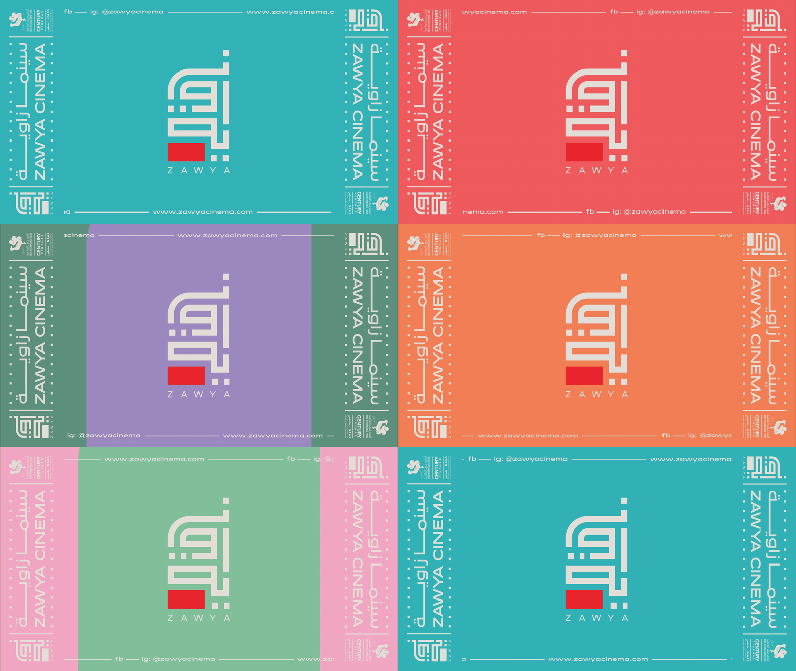
In 2013 I was working at Misr International Films, where the idea of creating Zawya - Egypt’s first arthouse cinema - was brewing.
I had a little bit of experience with branding work back then and was tasked with developing a logo for this new venture. It took very many iterations and some admittedly tense team meetings, before we finally settled on the rectangular kufi logo that Zawya launched with and used for its first 6 years of life (see animation below for the old logo and transformation). The logo (both versions) plays on the word 'Zawya', meaning angle in Arabic.
7 years later the Zawya team got in touch with me about revamping the logo. While it had become quite recognizable over the years (and even worked its way into a ‘downtown leftist bro starter pack’ meme), it looked a bit dated for 2020. And despite the bright, happy colors, we felt the angular shape communicated a seriousness and dryness that didn’t quite fit the brand personality. In addition we wanted to develop an extended visual identity that would make Zawya look coherent and recognizable across platforms.
7 years later the Zawya team got in touch with me about revamping the logo. While it had become quite recognizable over the years (and even worked its way into a ‘downtown leftist bro starter pack’ meme), it looked a bit dated for 2020. And despite the bright, happy colors, we felt the angular shape communicated a seriousness and dryness that didn’t quite fit the brand personality. In addition we wanted to develop an extended visual identity that would make Zawya look coherent and recognizable across platforms.
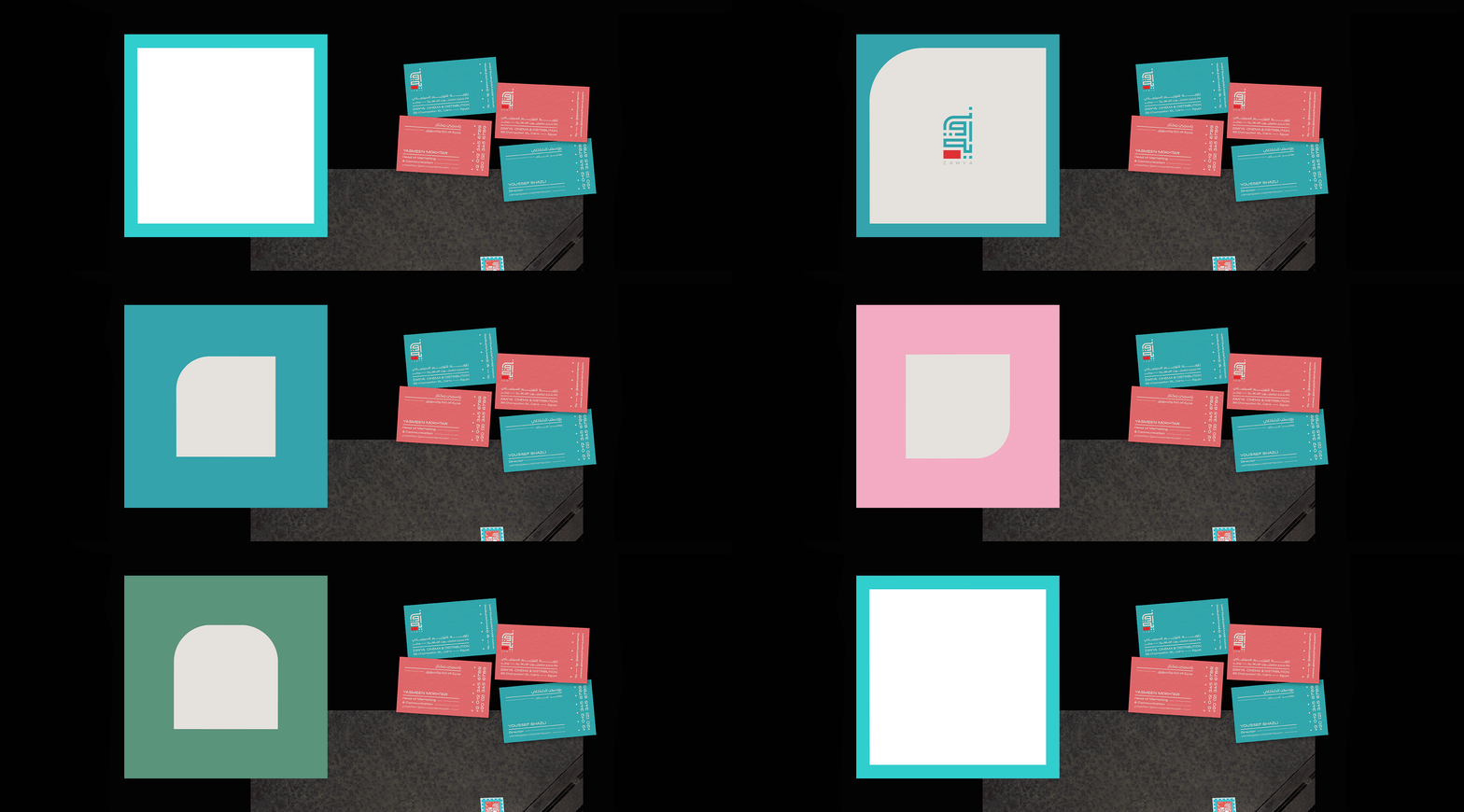
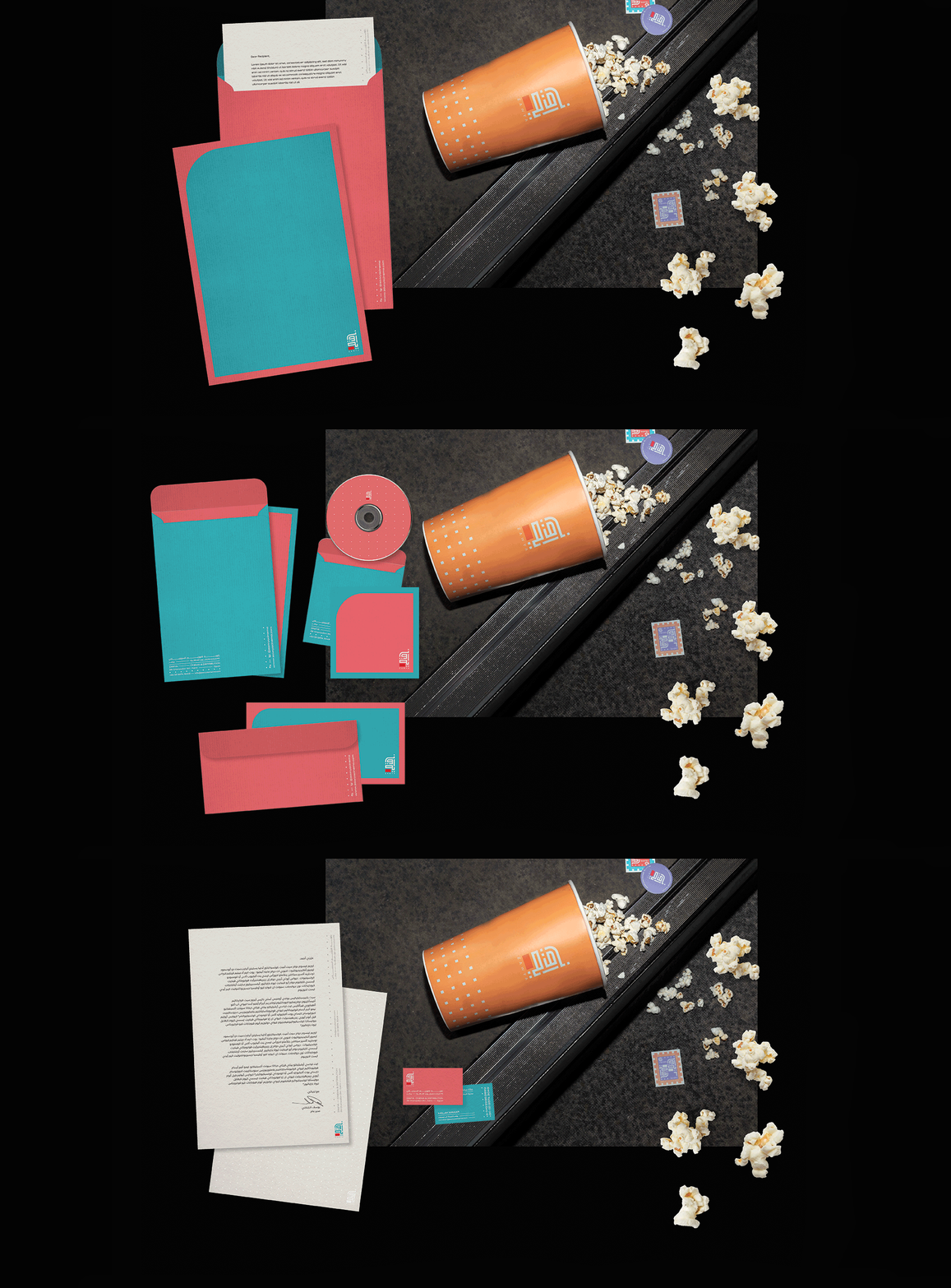
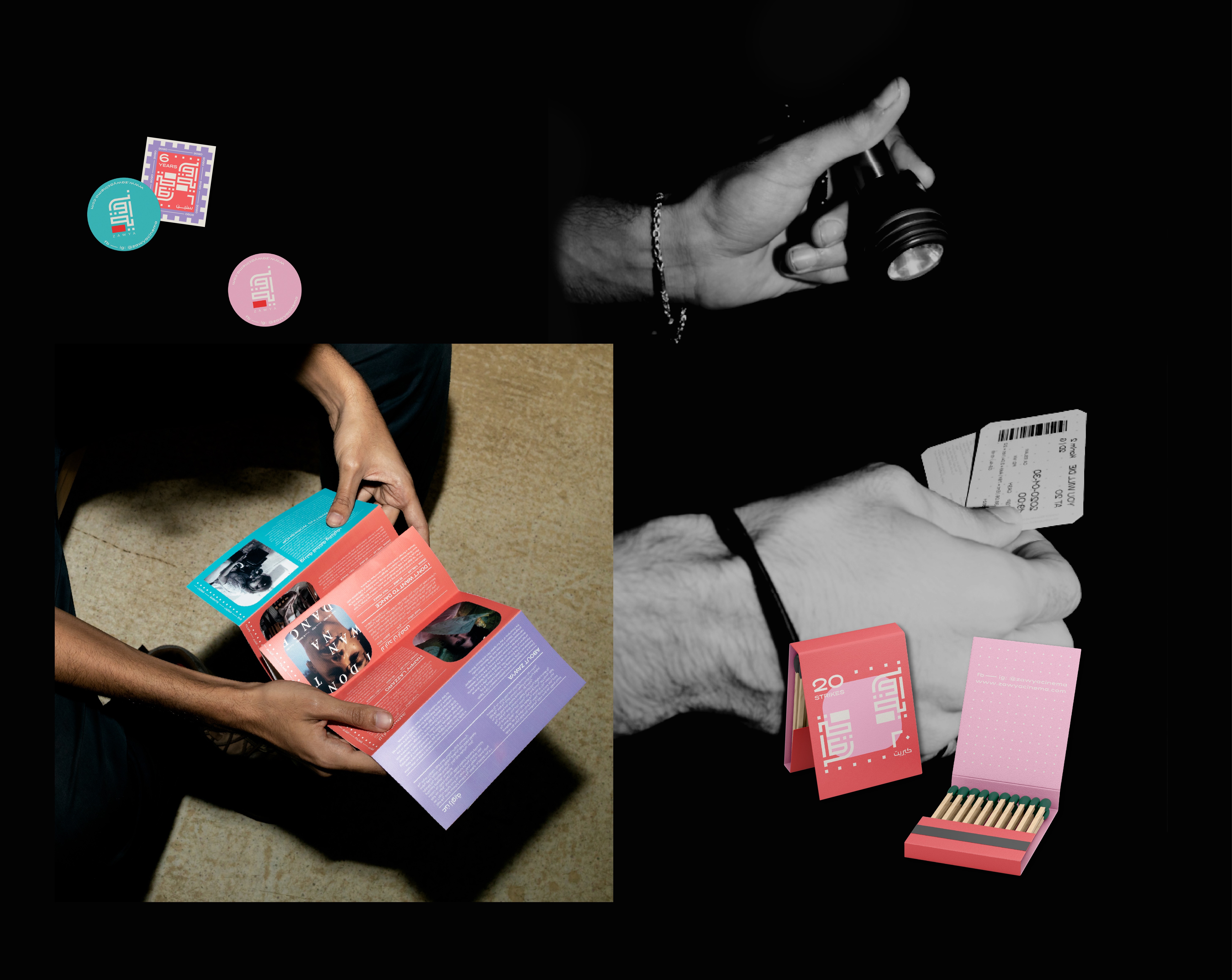
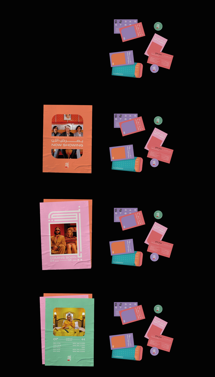
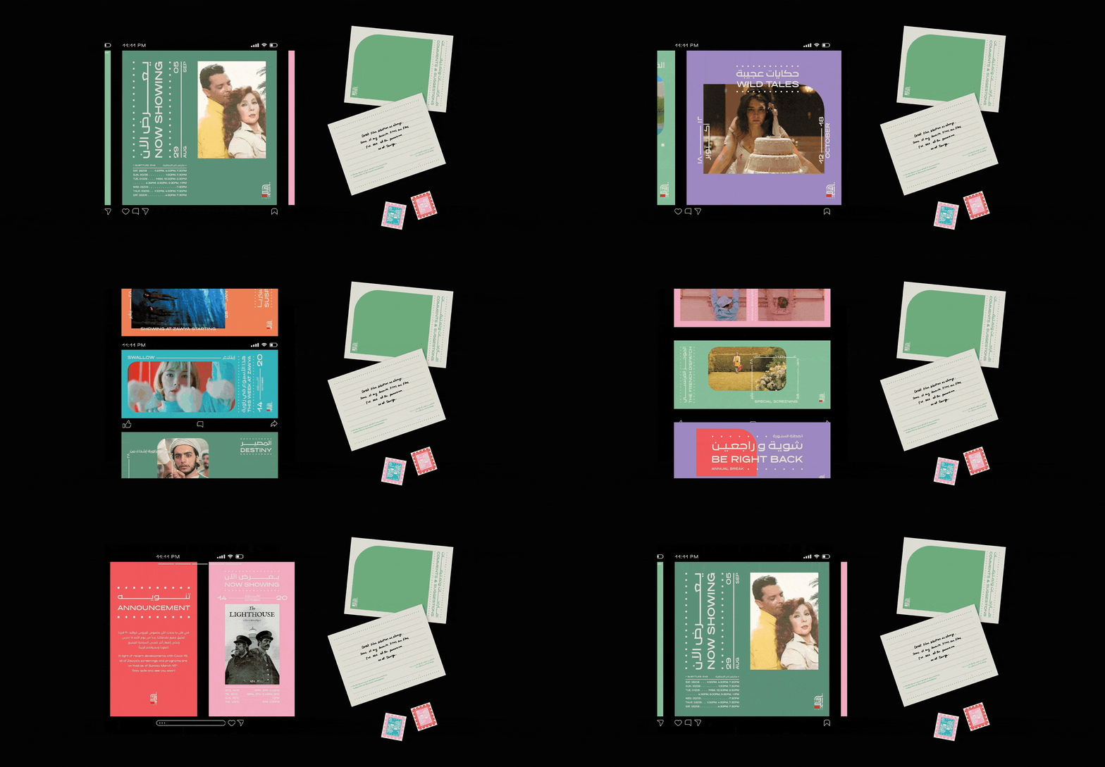
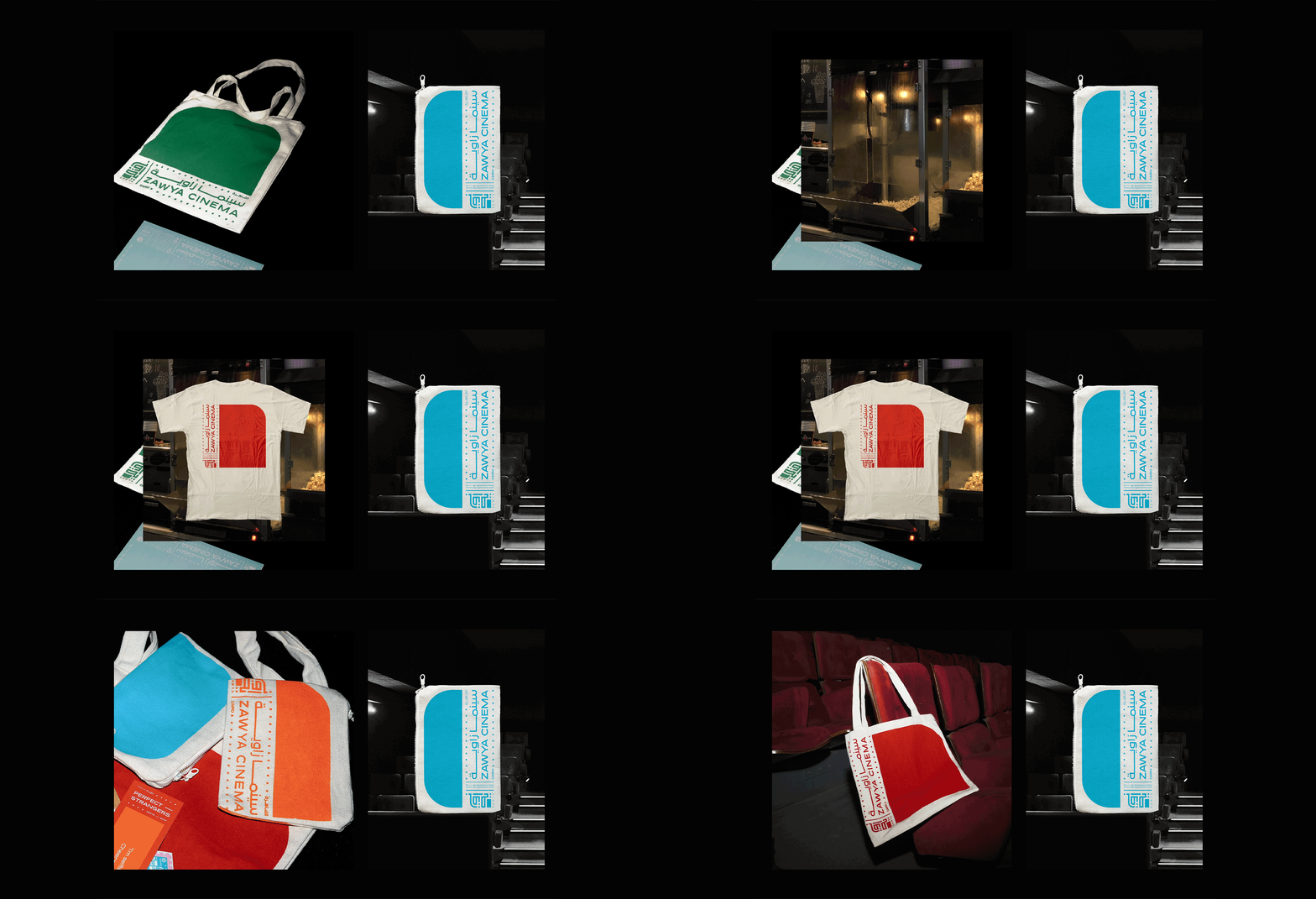
The scope of the project was quite large; it covered everything from office signage to invoice templates to merch to schedules, online and offline, and much more. I had the pleasure of putting together a small team, consisting of the brilliant Mina Maurice along with Mariam Ibrahim, but then we had the bad fortune of having to do the entire project remotely via Zoom in peak pandemic times (while staying on top of Tiger King watching commitments and the international banana bread fixation).


Our aim was to soften the brand, create a friendlier and more relaxed logo and add a colorful and distinctive brand identity to go with it. Zawya’s teal and red had a lot of brand recognition, so in order to capitalize on that we chose to keep, but slightly tweak the two colors. And we added a diverse set of secondary colors that would help keep social media posts fresh and varied. The new identity references 35mm film, while still playing on the theme of angles & corners for continuity. The shapes with the rounded corners reference the logo’s outline and communicate a younger, more light-hearted Zawya.

EXHIBITIONS
︎︎︎ The revamp announcement posters were selected as part of Cairopolitan’s Cairo Prints II in 2021 and were showcased in a group exhibition at the Cairopolitan gallery, the Institut Français d’Égypte and the Institut Français d’Archéologie Orientale in Cairo that year.
PURCHASE
︎︎︎ Both posters are available for purchase at the Cairopolitan store and through their website.
︎︎︎ Zawya merch is available on location at Zawya cinema downtown and through their website.
CREDITS
︎︎︎ Project designed with Mina Maurice and Mariam Ibrahim
︎︎︎ Website and portfolio designed with Mariam Khattab

