2014
Eish + Malh
BRANDING


Eish + Malh opened in 2014 on Adly street in downtown Cairo. The owners, Dina Abdoulseoud and Nadia Dropkin, had previously opened Kafein, a little café serving artisanal coffee and specialty tea, just a few steps away. With Eish + Malh they were interested in opening a more spacious restaurant that could act as a community space with live music, film screenings and slow food markets.

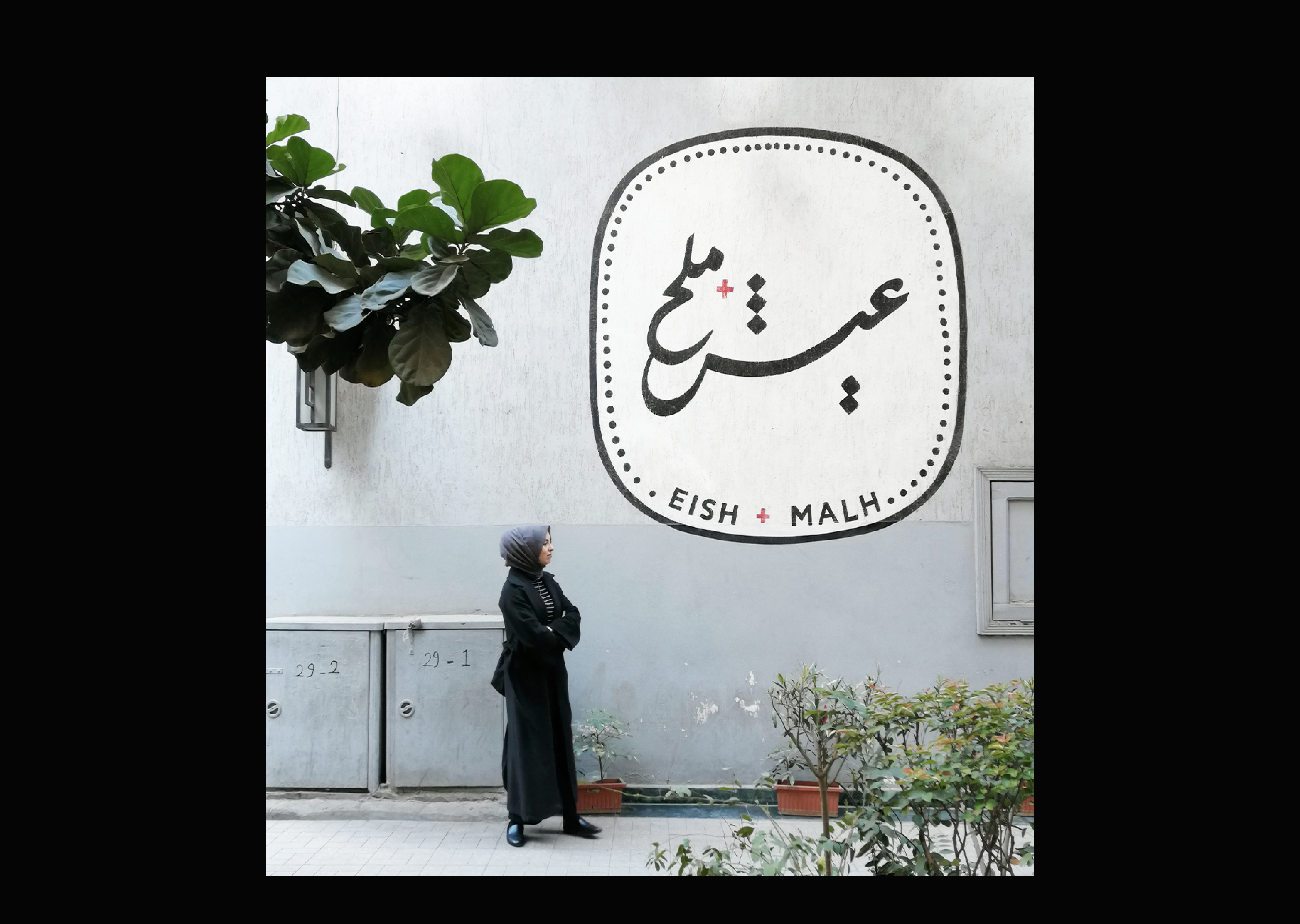
For the logo, calligraphy felt like a natural choice. It was important for us to create a logo that fits well in downtown Cairo and complements its surroundings. We wanted it to be neat and quite classical and Egyptian and so we took inspiration from 1950s signage and lettering. The calligraphy was done by the very talented Magdy Helyl. We worked together to develop a few options, and finally settled on this farisi / nasta3leeq direction with some playful tweaks to give a young and friendly essence to the brand.

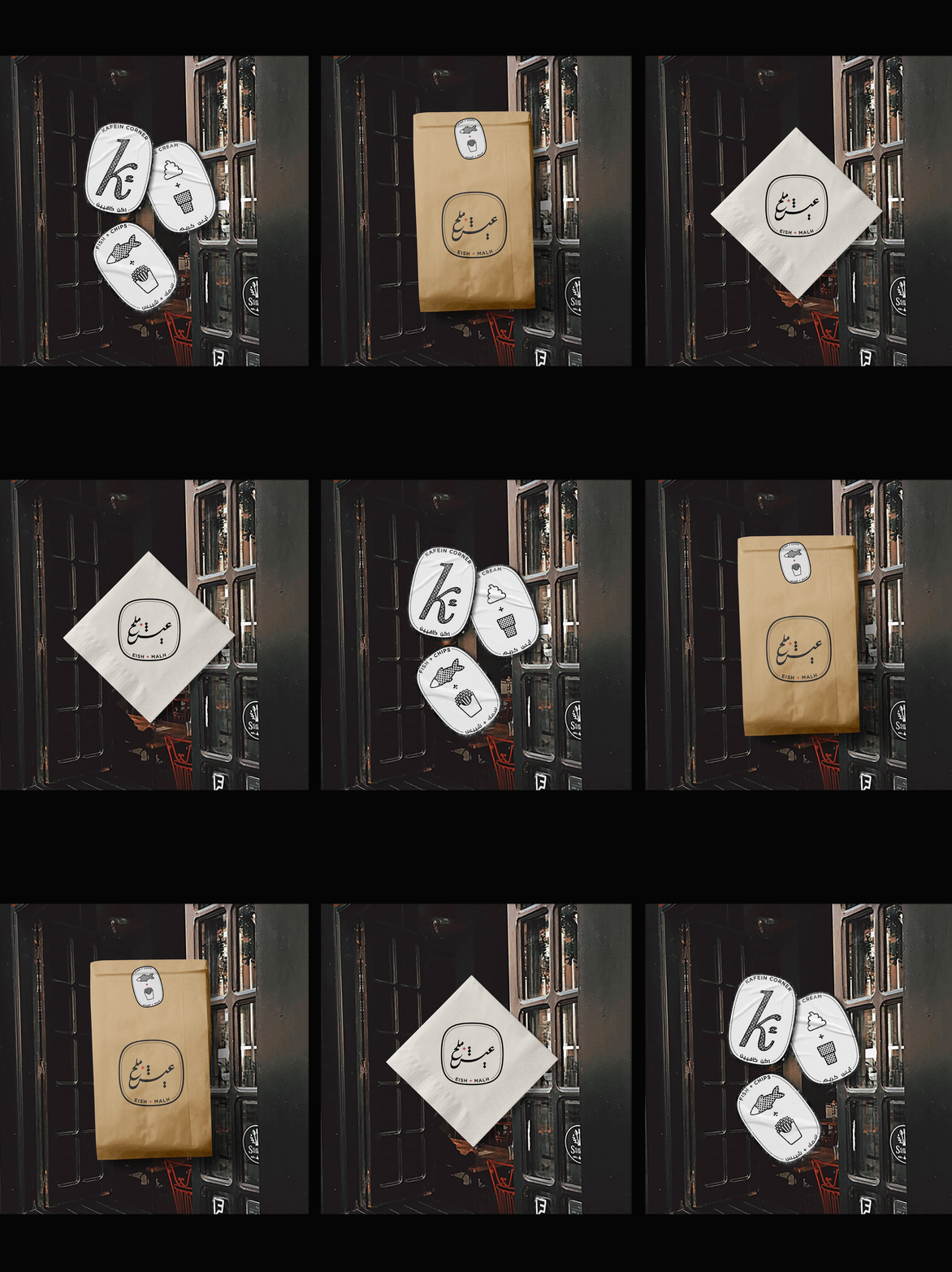
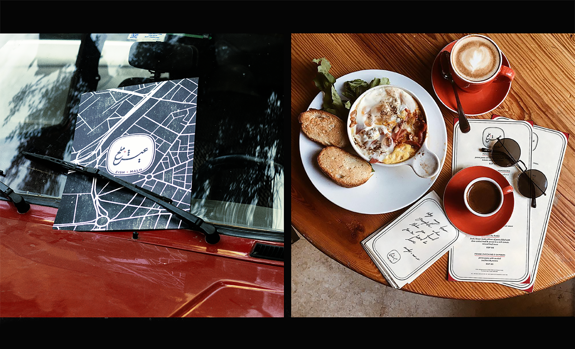
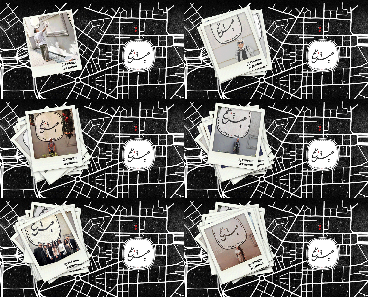
We took cues from the space itself for the brand colors. The previous restaurant had painted little details in red and we felt it was fitting to keep these red highlights and incorporate them into Eish + Malh’s brand identity. Initially the window at the Kodak passageway was meant to sell fish & chips, ice cream and Kafein menu items to go and so we created icons to paint on that wall. Ultimately, the to-go window was scrapped and so the E+M logo was painted there on its own and has since become a bit of a selfie spot downtown.

CREDITS
︎︎︎ Calligraphy by Magdy Hellyl
︎︎︎ Website and portfolio designed with Mariam Khattab
︎︎︎ Photos from Eish + Malh, Efnan Ghoneam, Reem Omar, Kholoud Elmahdy
︎︎︎ Project photography by Kafrawy
︎︎︎ Calligraphy by Magdy Hellyl
︎︎︎ Website and portfolio designed with Mariam Khattab
︎︎︎ Photos from Eish + Malh, Efnan Ghoneam, Reem Omar, Kholoud Elmahdy
︎︎︎ Project photography by Kafrawy


