


2013
Kafein
BRANDING
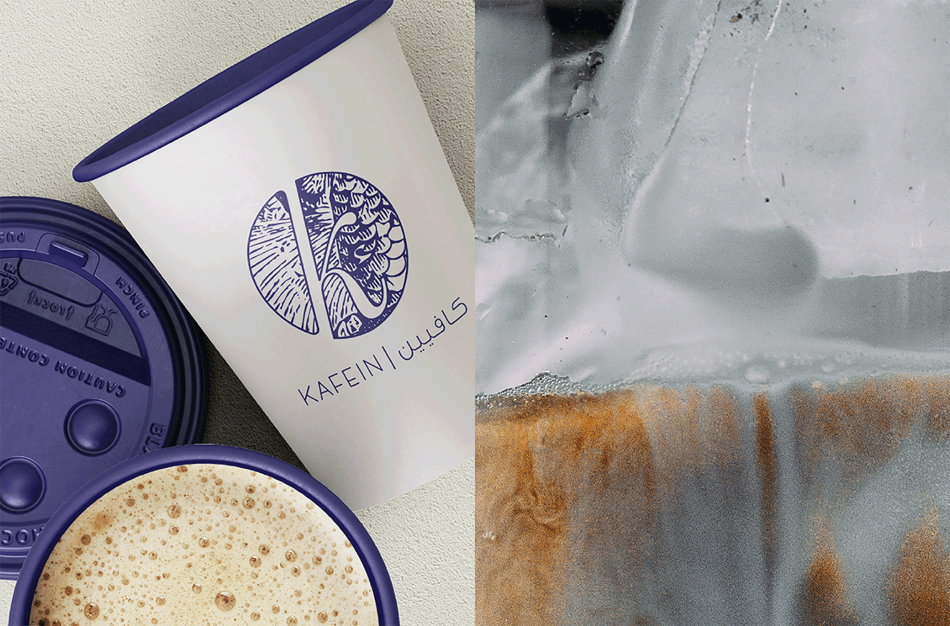
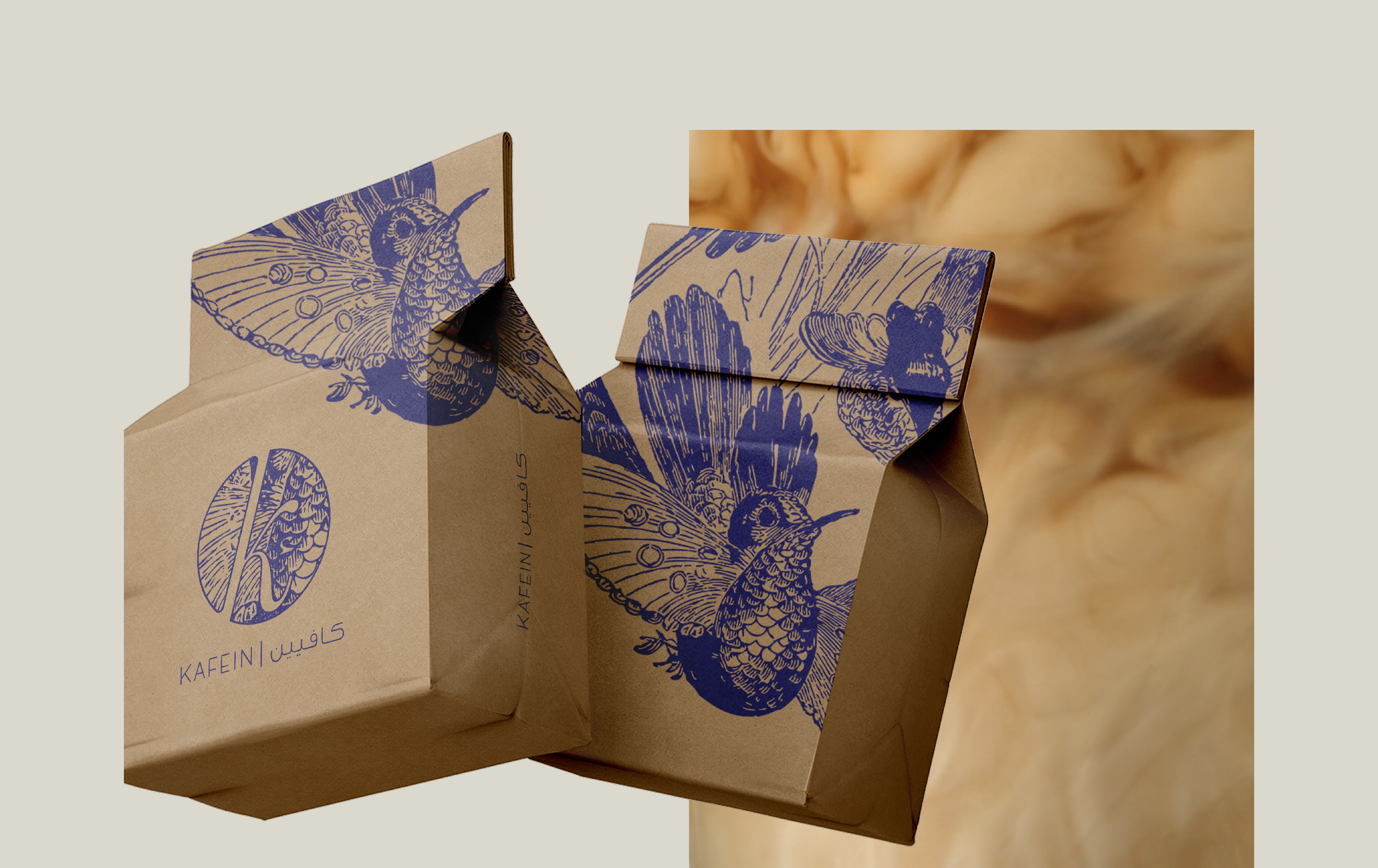
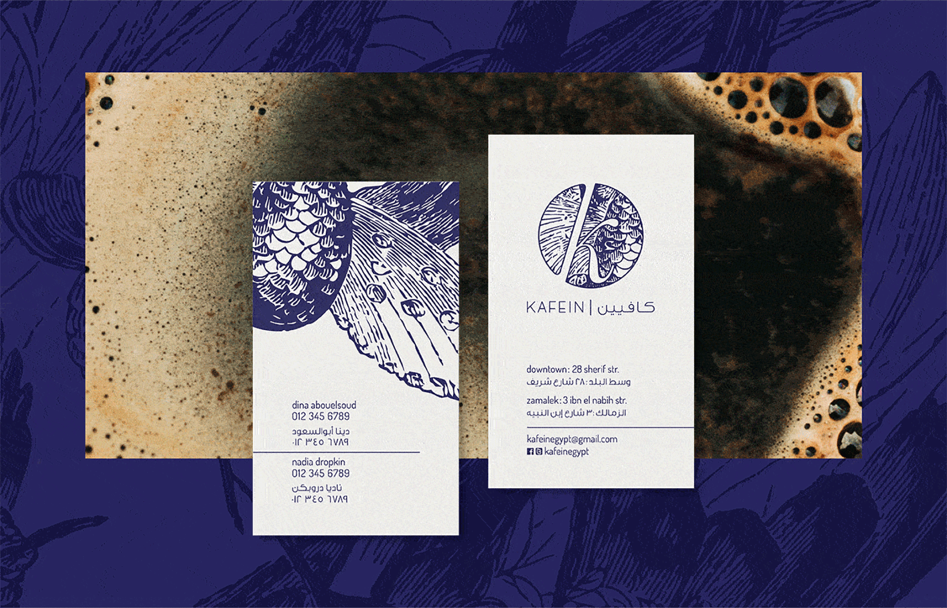
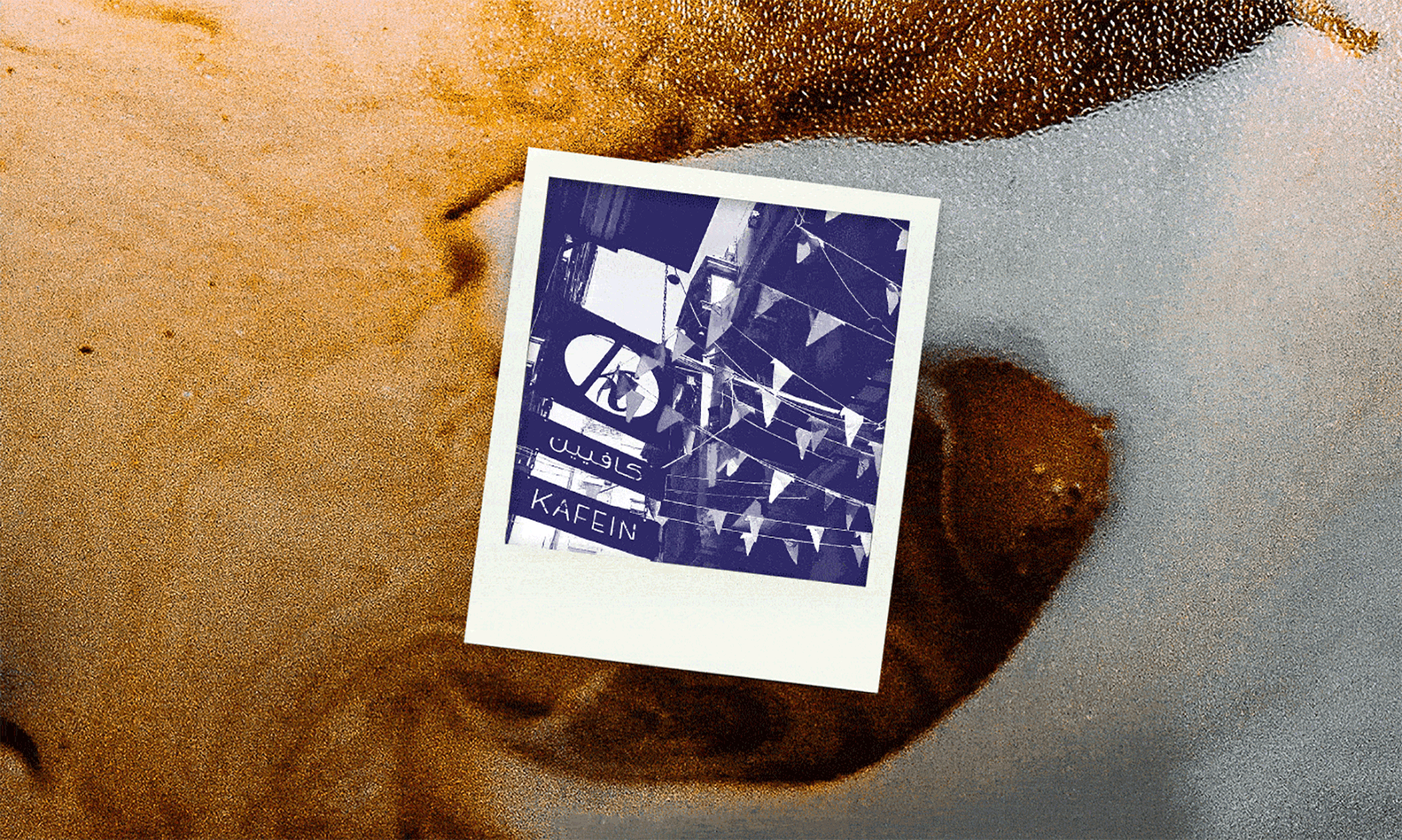
Kafein opened in 2013 on Sherif street in downtown Cairo. It was a small café serving specialty coffee, tea and herbal drinks, along with small snacks and pastries. The owners, Dina Aboulseoud and Nadia Dropkin, wanted to create a calm, friendly space that felt welcoming and social, but that was also well-suited for coworking and studying. The space was quite sunny and bright with white walls and wooden fixtures and the idea was to create a visual identity that would complement the space and give a sense of neat serenity and optimism.
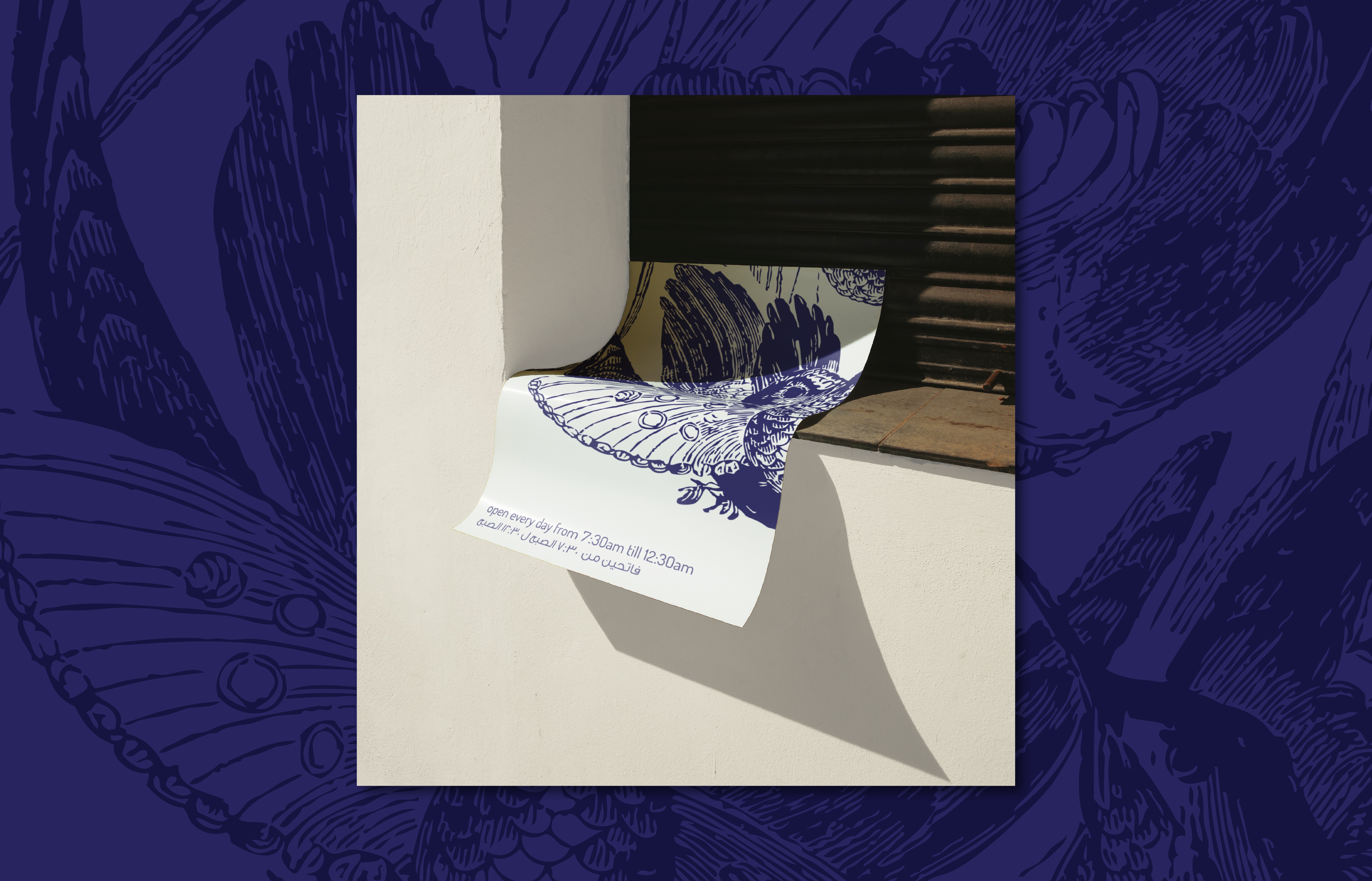
The idea of including birds in the identity came from a doorbell chime box that we found in the space, left behind by the previous occupants. It had a navy blue illustration of 2 birds sitting on branches and we felt it would be sweet and meaningful to incorporate that idea into the brand identity. The hamza from the Arabic kaaf (or more accurately: the miniscule kaaf) was added to the ‘k’ in the icon to create a connection between the name in English and in Arabic. And the circular shape of the logo with the diagonal gap was intended to vaguely reference a coffee bean.

Unfortunately Kafein closed its doors in 2018, but is survived by its sister establishment Eish + Malh on Adly street. The café that has replaced Kafein is called Kapri and has a suspiciously similar logo to Kafein’s, so in a way a trace still remains.
CREDITS
︎︎︎ Website and portfolio designed with Mariam Khattab
︎︎︎ Photos from Kafein, Eslam Salah and Mina Albert
︎︎︎ Website and portfolio designed with Mariam Khattab
︎︎︎ Photos from Kafein, Eslam Salah and Mina Albert